
Responsive Web Design Services for Fast, Clear Experiences Across Every Screen
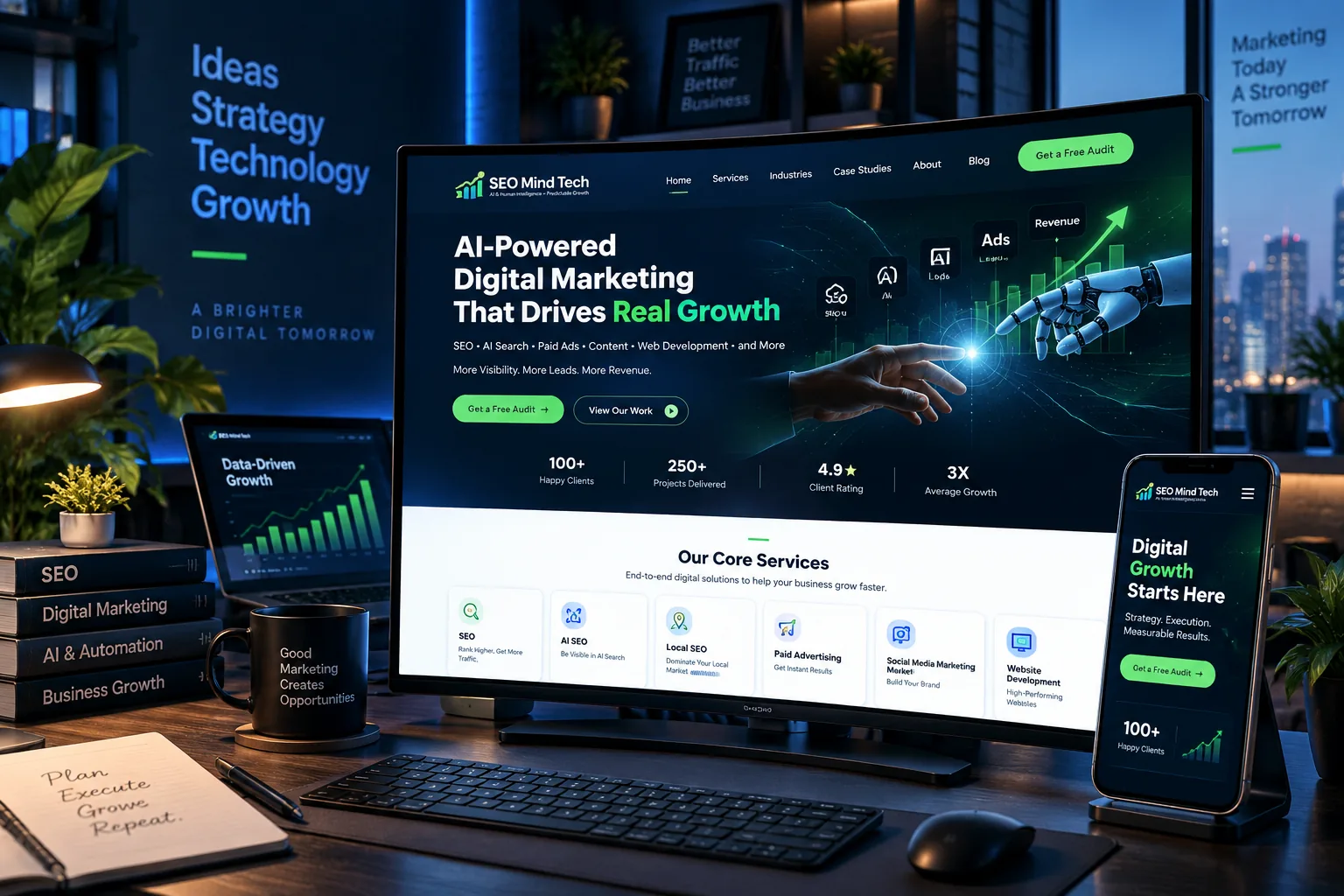
SEO Mind Tech designs and rebuilds websites so navigation, content, forms, images and calls to action adapt intelligently across phones, tablets, laptops and large displays. Responsive design is treated as usability and conversion engineering, not simply shrinking desktop layouts.
Why responsive design matters
Customers change devices constantly, but their expectations do not.
Better mobile UX
Readable content, touch targets and simplified navigation reduce frustration.
Stronger conversion journeys
Forms and CTAs remain usable without zooming, overflow or hidden actions.
SEO and performance support
Mobile-first indexing and Core Web Vitals make responsive quality part of technical search health.
Lower design maintenance
One flexible system is easier to manage than separate desktop and mobile websites.
What we improve
Responsive design includes layout, performance and interaction behavior.
Responsive grid and typography
Fluid spacing, readable line length and scalable type.
↗Mobile navigation
Menus, sticky CTAs and interaction patterns optimized for touch.
↗Responsive media
Images/video that preserve quality without unnecessary page weight.
↗Forms and checkout
Input controls and payment steps designed for smaller screens.
↗Cross-browser QA
Test key journeys across major browsers and viewport sizes.
↗Performance QA
Review layout shift, image sizing and mobile script impact.
↗Responsive design process
Audit → prioritize → redesign → test → launch.
Device/analytics audit
Clear output, owner and next decision at each stage.
Mobile-first wireframes
Clear output, owner and next decision at each stage.
Responsive UI system
Clear output, owner and next decision at each stage.
Cross-device QA
Clear output, owner and next decision at each stage.
Launch and monitor
Clear output, owner and next decision at each stage.
Questions, answered
Frequently asked questions
Useful context before we scope the work around your actual baseline.
Can you make an existing site responsive?+
Yes, if the current platform and theme can support the required changes. Otherwise a redesign may be more efficient.
What devices do you test?+
We test representative mobile, tablet and desktop sizes plus major browsers.
Does responsive design help SEO?+
It supports mobile usability and performance, which are important parts of modern search experience.
Do you design mobile first?+
Yes for many projects, especially where mobile traffic dominates.
Will responsive design slow the site?+
It should not. Good responsive implementation uses appropriately sized assets and efficient CSS/JS.
Can you fix only specific responsive issues?+
Yes. Focused remediation is possible without a full redesign.
Evidence over invented numbers
Results and reviews should be real, attributable and useful.
Verified case studies and connected Google reviews can populate proof sections without fabricating performance claims.
Add verified projects in WordPress and this section will populate automatically.
Your next move
Want a strategy built around your current website, market and goals?
Start with the baseline. We’ll identify the most useful next step.